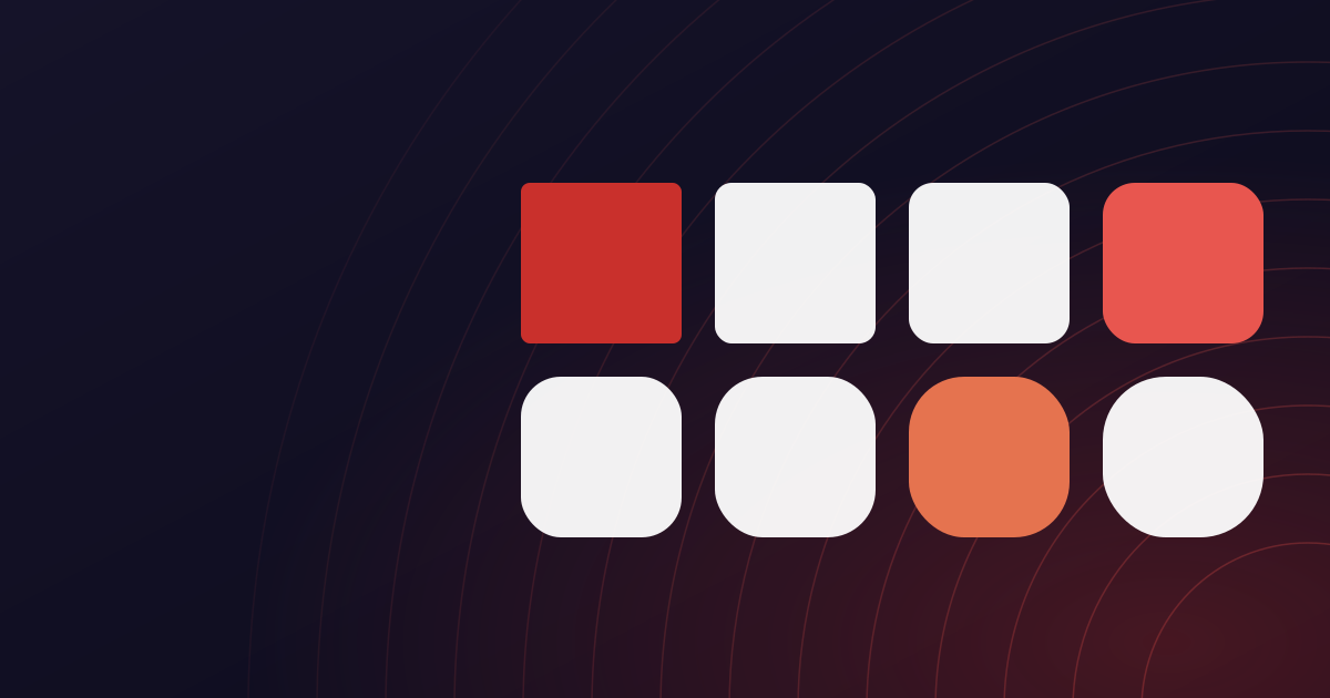
A page offering a dozen tools has a scanning problem. Everything is a rectangle with an icon and a label, and if they all look equally important, none of them do.
Colour carries the file type
One accent colour, used for one kind of file. There is no second category to tell apart any more, so the colour's job is to mark what is interactive rather than to sort a grid - and a page of cards reads as one set instead of two.
Indigo is reserved for actions. If something is indigo, it is a button or a link. Teal appears only in the logo and the orbit rings, so the brand mark never competes with a call to action.
Contrast is a rule, not a preference
Every colour pairing is checked against WCAG AA on the surface it actually sits on. Our muted grey is the lightest text permitted anywhere in the product, and it is set by its contrast on a shaded panel rather than on white - the harder of the two cases.
This is enforced rather than encouraged: a component that hardcodes a colour instead of using a token fails the build.
The calm is deliberate
There are no adverts, no interstitials, and no countdown before a download. A file tool is something you visit with a task and leave when it is done, and the design is built for leaving quickly.